I’m an independent art director and graphic designer based in Paris specializing in brand identity, editorial design, and typography.
I’m fascinated by found ephemera, shop fronts, food and colors. What made me want to do design ? The ice cream trucks’ menus and the book cover of « Les Mariés de la Tour Eiffel » by Robert Massin. For more information, or any collaboration please feel free to contact me.
About
Work
01 .
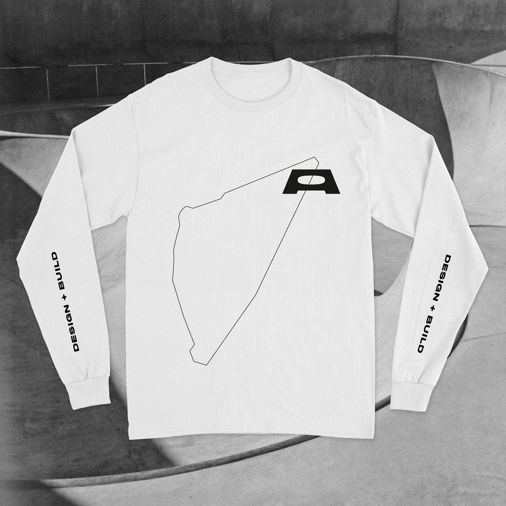
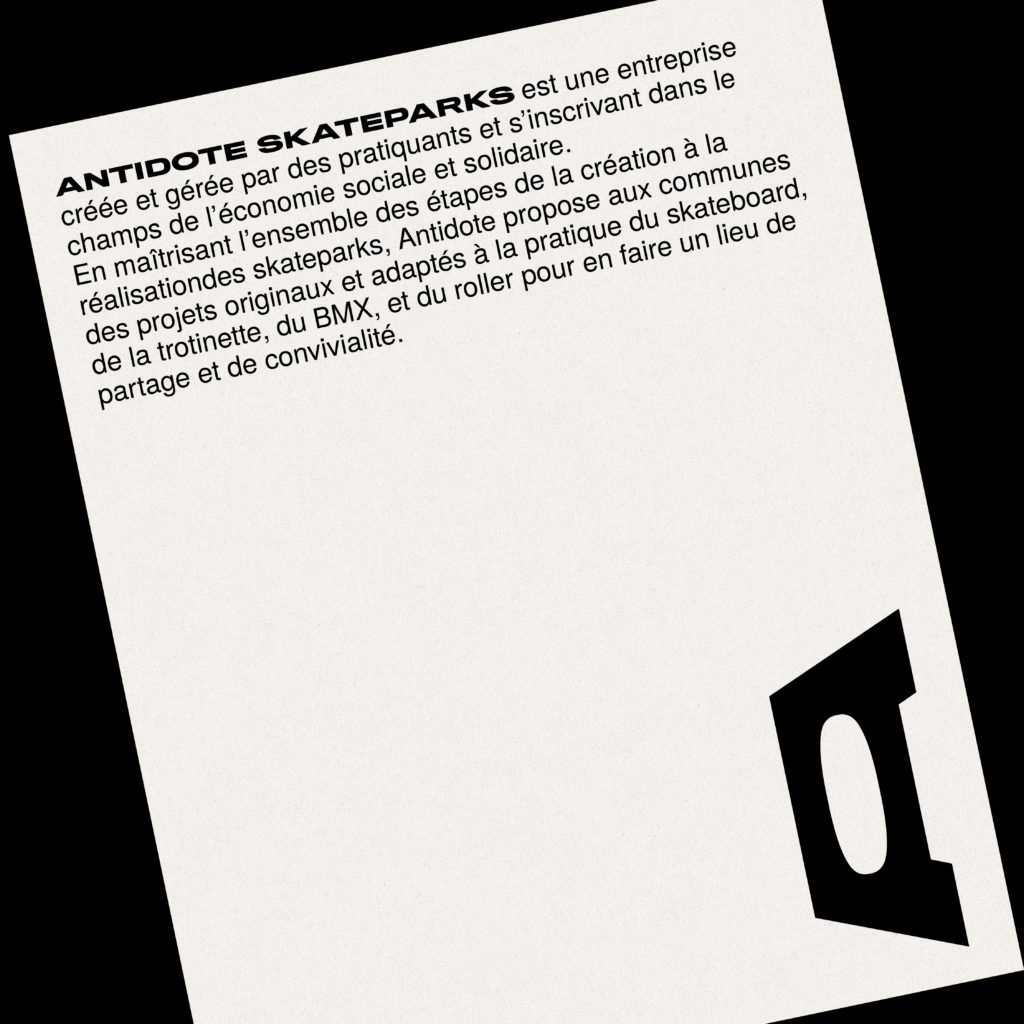
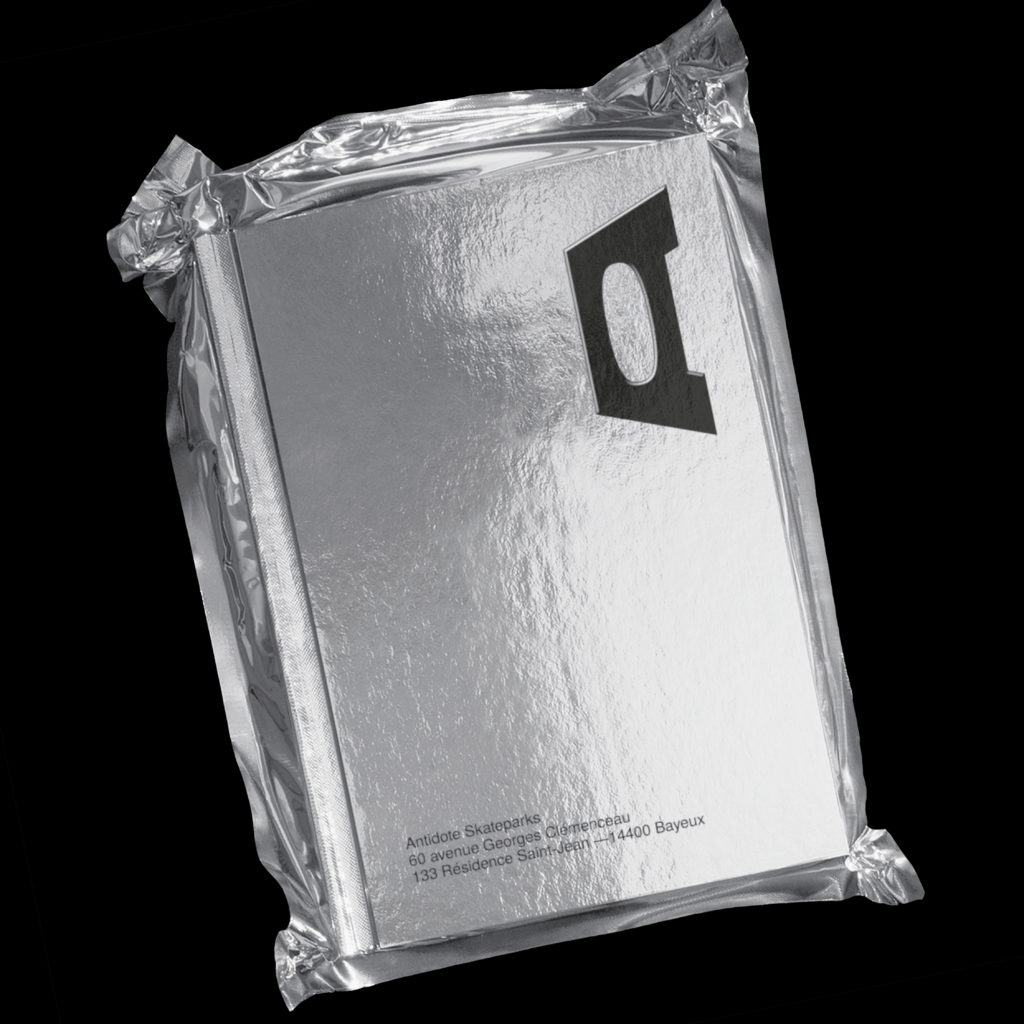
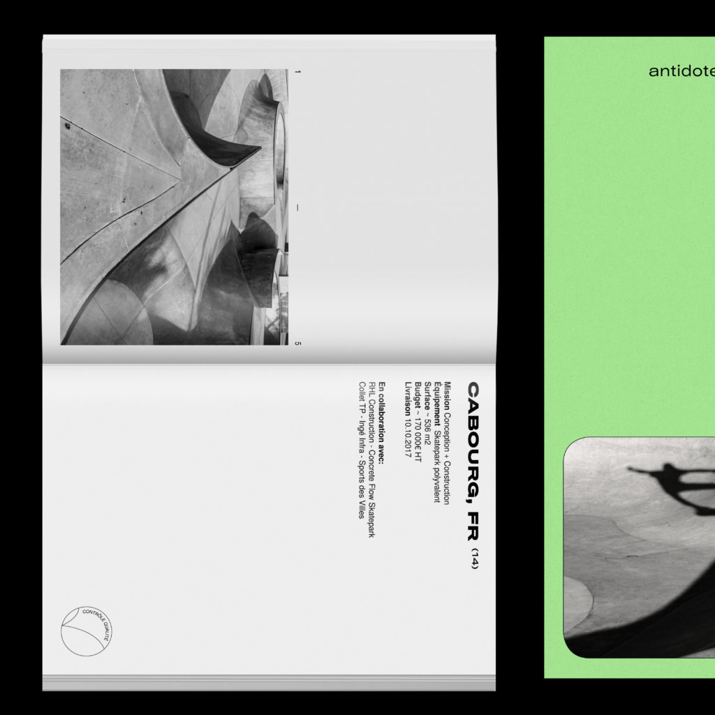
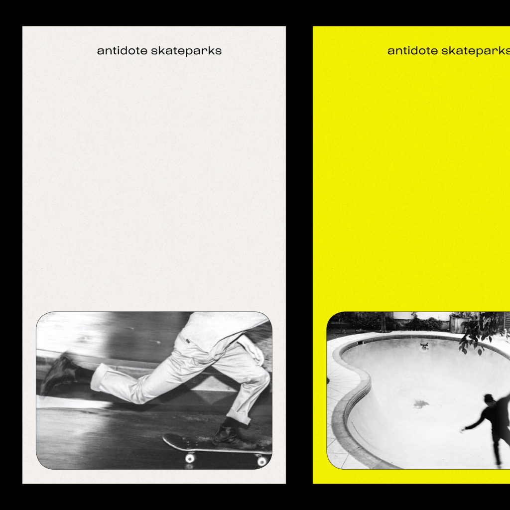
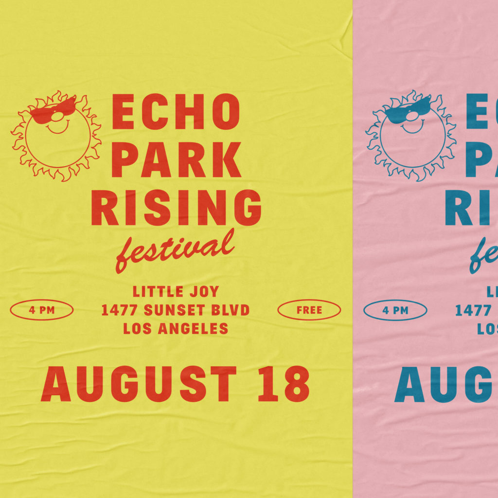
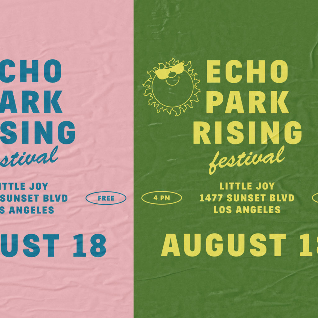
Antidote Skateparks
- branding
Founded by longtime skateboarders Pierre, Julien and Léo, Antidote Skateparks is a friend-run company that grew out of a simple desire to make the most fun, finely crafted skateparks possible. Craftsmanship and skate-ability remain at the heart of their business that builds concrete skateparks worldwide.
The main challenge was to build a cohesive and compelling branding to target their two different audiences. The identity merge the skate aesthetic and a minimalistic tone referencing to the engineering part of their job.
The logo is inspired by concrete skateparks elements, a solid box with curves that evoke a bowl. The color palette as well is based on textures reminiscent of skateparks with pops of bright colors.
02 .
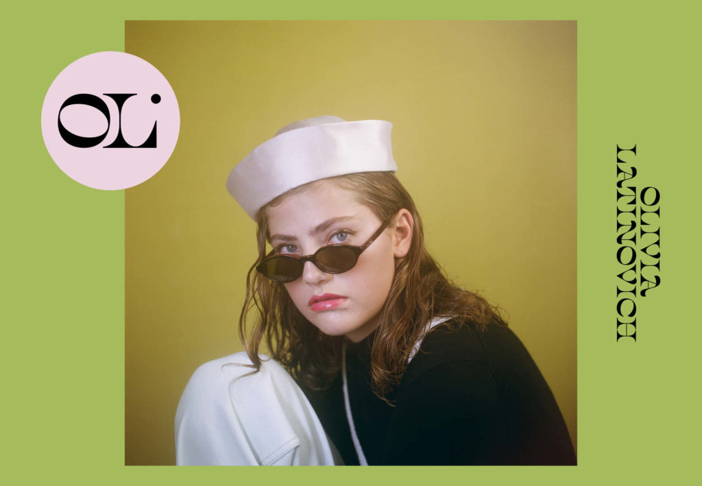
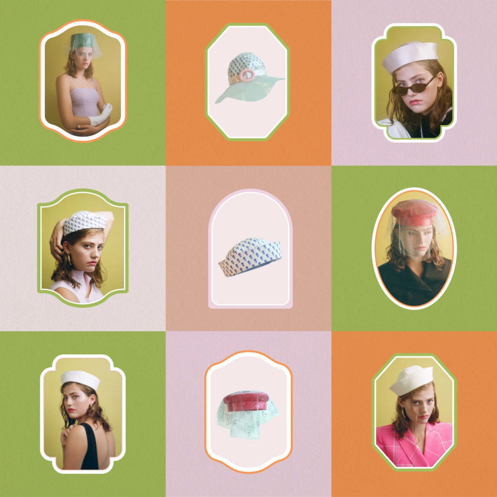
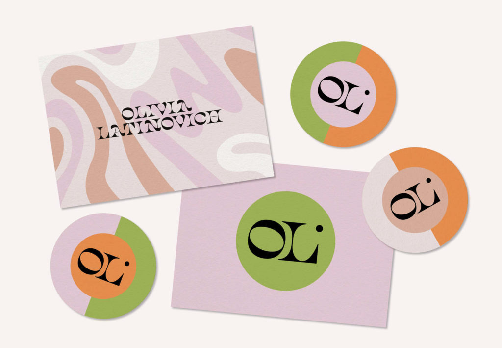
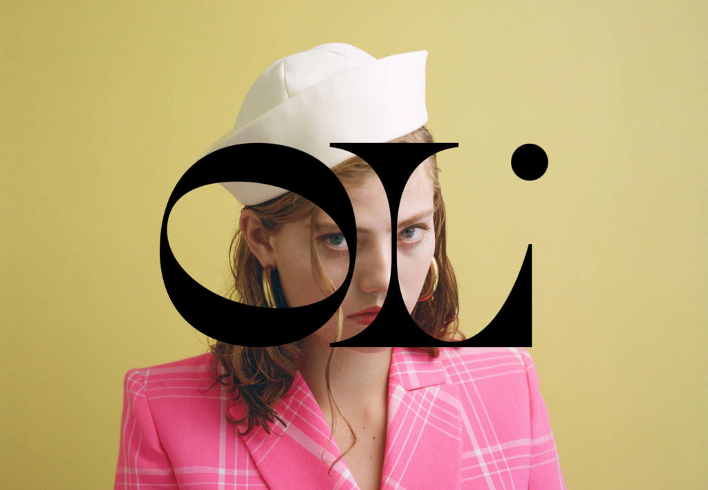
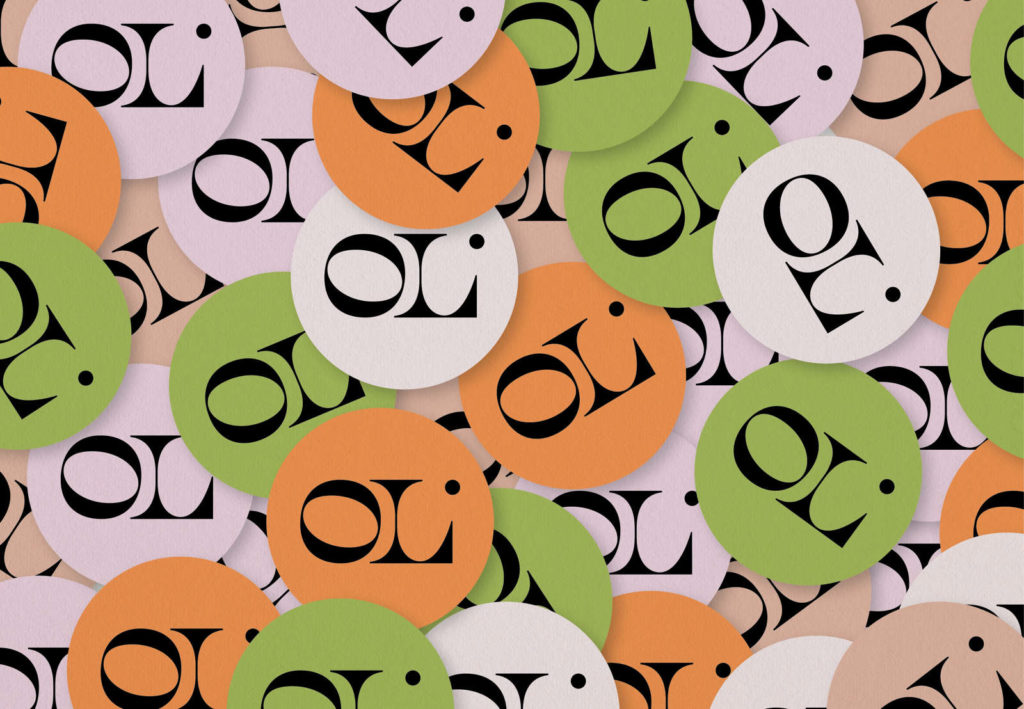
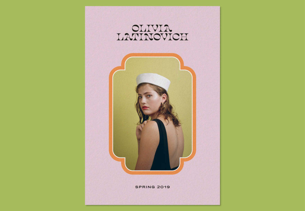
Olivia Latinovich
- art direction, branding
Olivia Latinovich is a hat designer based in Los Angeles. Her new brand finds its narrative in the French Nouvelle Vague aesthetic, using feminine, vintage and bold fashion designs with pops of color. For the branding, we reinterpreted design elements from Biba’s and 1960’s Art Nouveau to create a contemporary logo, patterns and color palette.
Branding: logo & monogram creation, visual identity, packaging, social media guidelines
Project in collaboration with Leslie David Studio.
Photo: Brian McGuffog
03 .
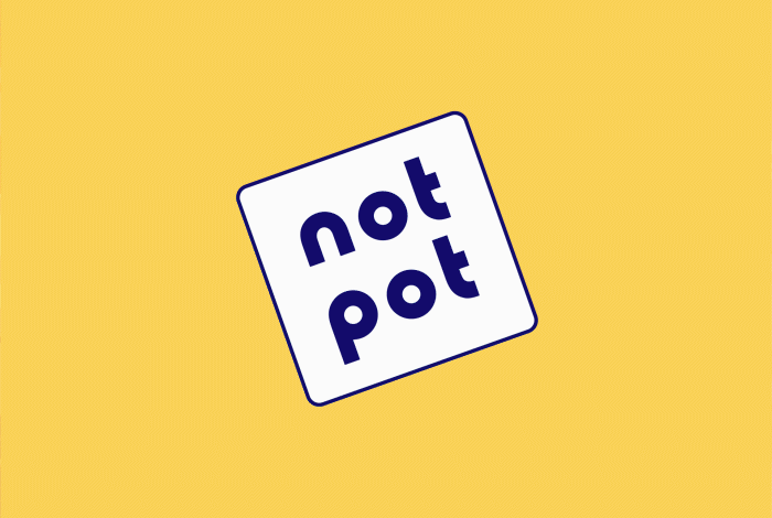
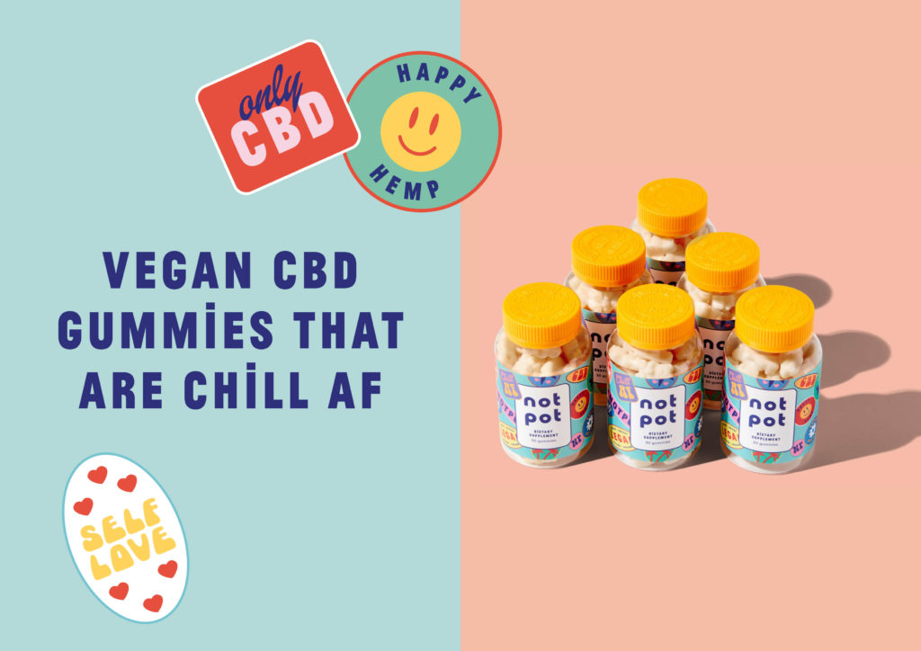
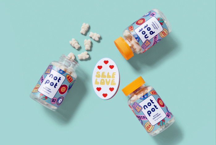
Not Pot
- art direction, branding
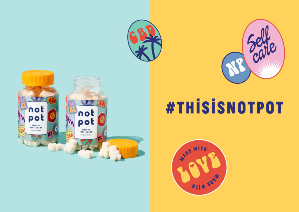
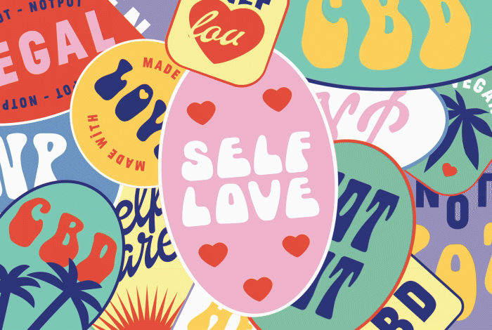
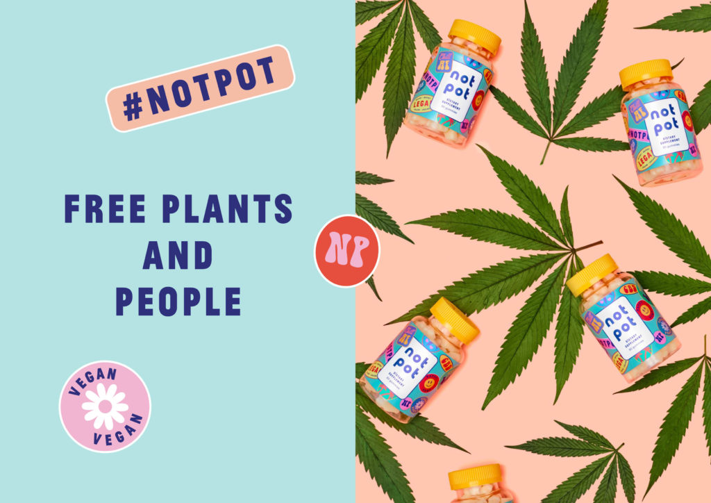
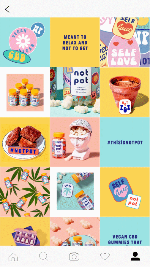
Not Pot is a California based company specialized in vegan CBD gummies. Surfing on this new legal trend, these organic candies are made to help you relax without making you high. Branding in the CBD industry most of the time aren’t talking to women and millennials, they instead focus on recreative drugs aesthetic. Our challenge was to design a digital identity for a direct to consumer brand that came to life thanks to the creation of friendly stickers, a colorful palette, a vibrant typography, and a playful web design. We ended up creating fun and educative design content made to help consumers to understand CBD with a 70s twist.
Project in collaboration with Leslie David Studio.
04 .
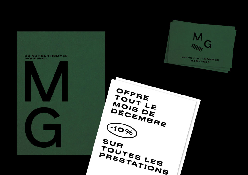
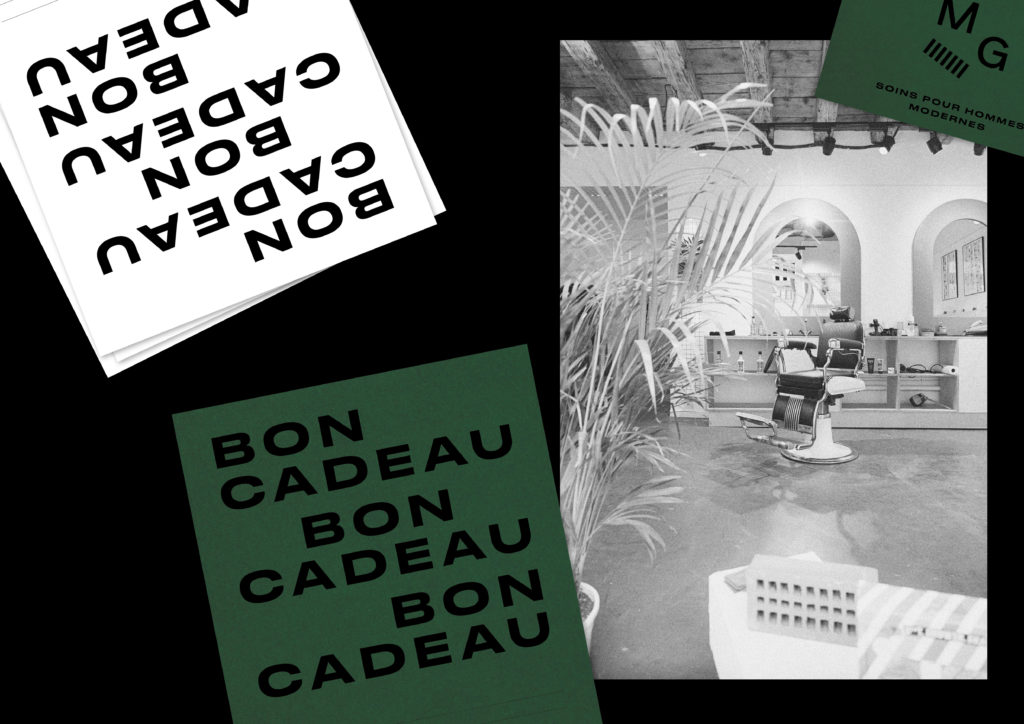
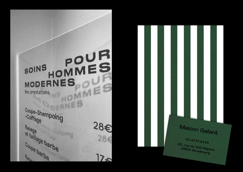
Maison Galant
- visual identity
Visual identity of Maison Galant, a shop specialized in men’s grooming based in Strasbourg (FR).
Logotype, business cards, flyers, stationery.
Photo credit: Henri Vogt
05 .
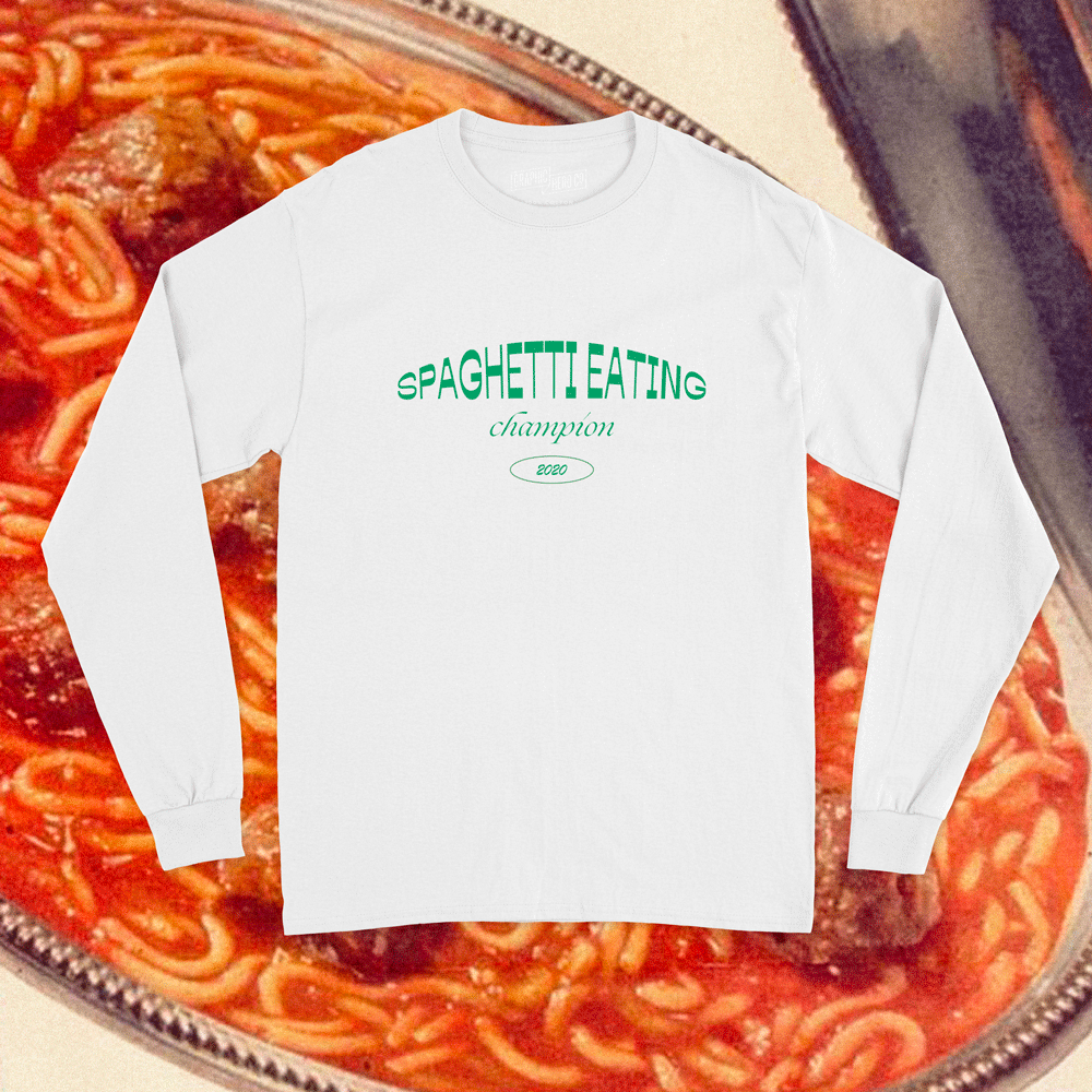
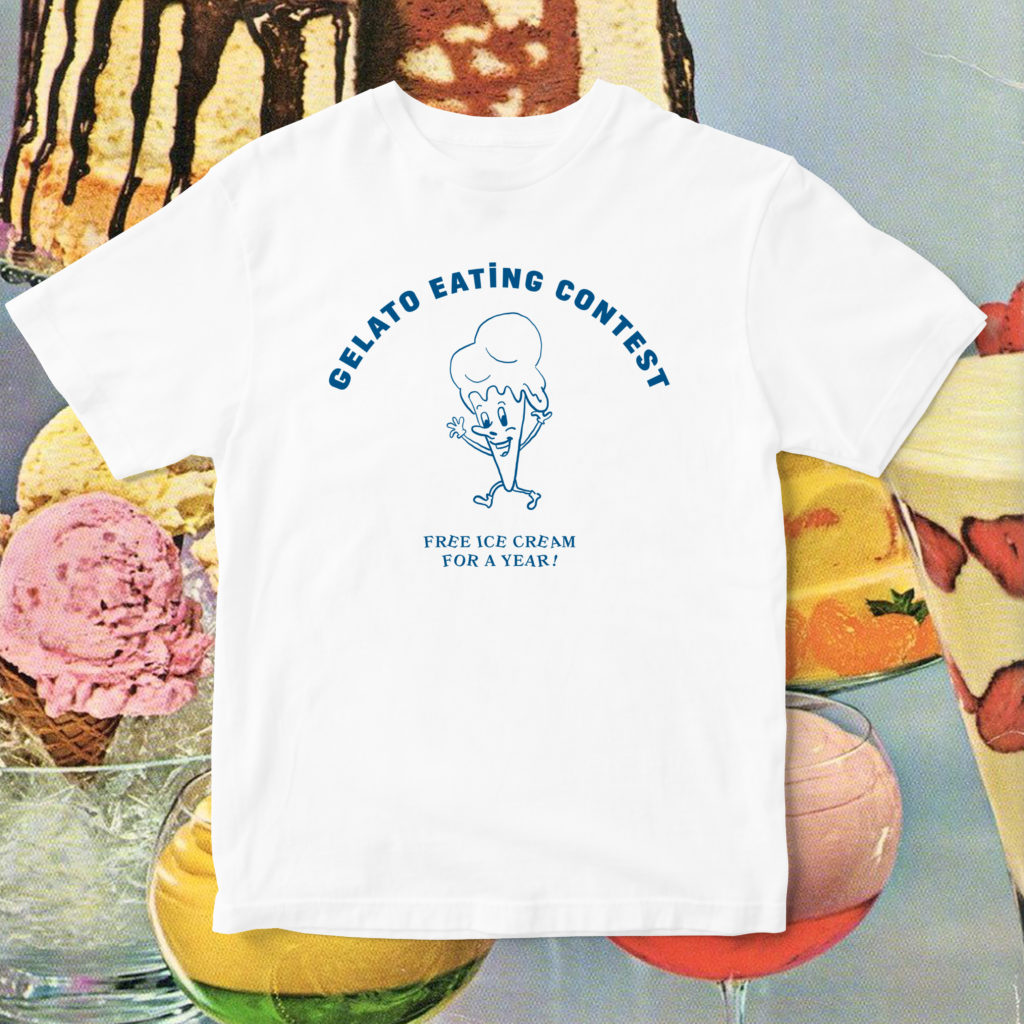
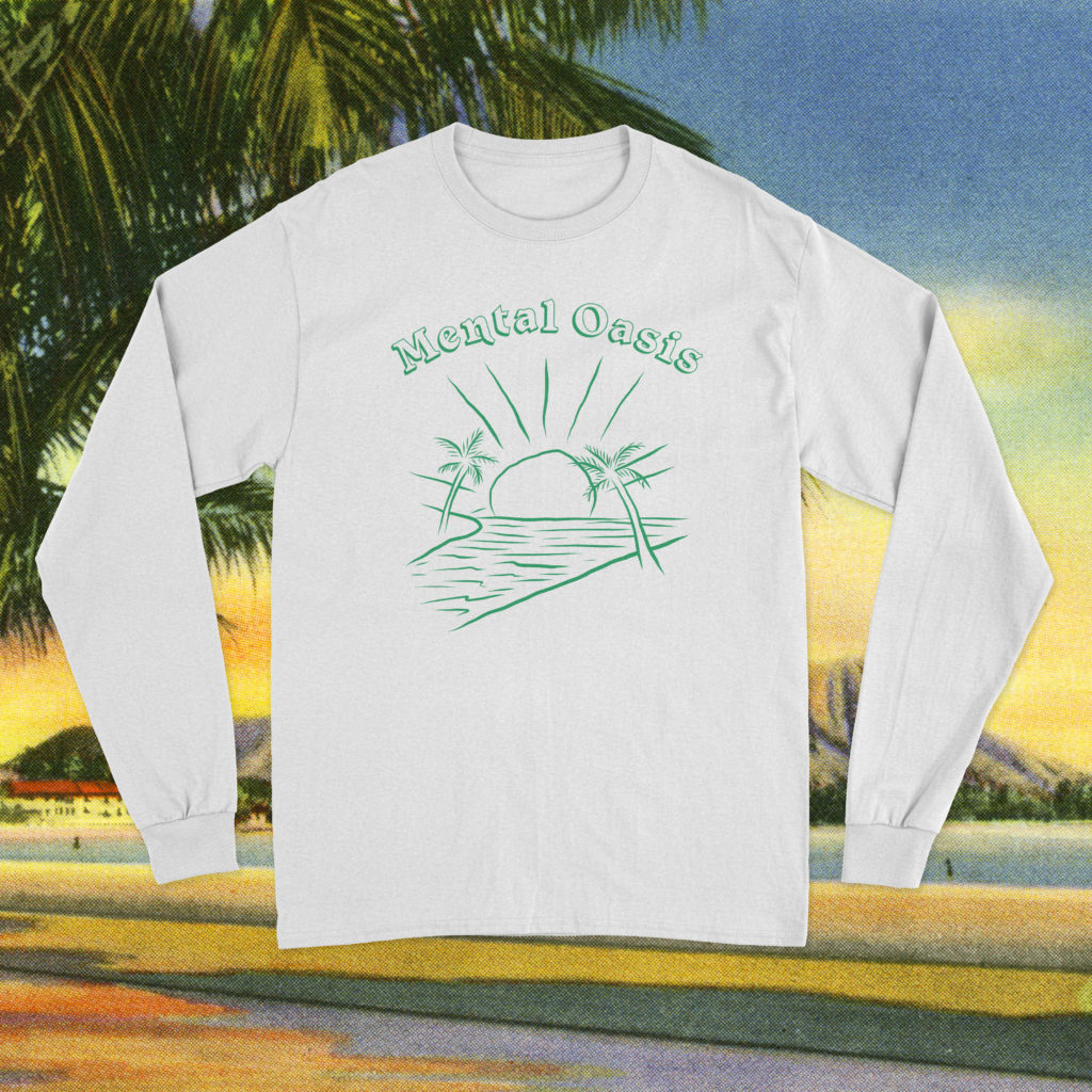
Ban.do
- apparel, illustration
Ban.do is a lifestyle brand based in sunny Los Angeles that designs clothes, accessories, gifts, stationery, and more.
Since 2018, I’m part of their amazing team of artists among really talented women. I’ve been commissioned to create surface design for their SS 2020 clothing collection – this is inspired by tees and ephemera you could find at flea markets, thrift stores or gas stations! It was very fun to work on the concept, copy and design and challenge myself to do more illustration.
06 .
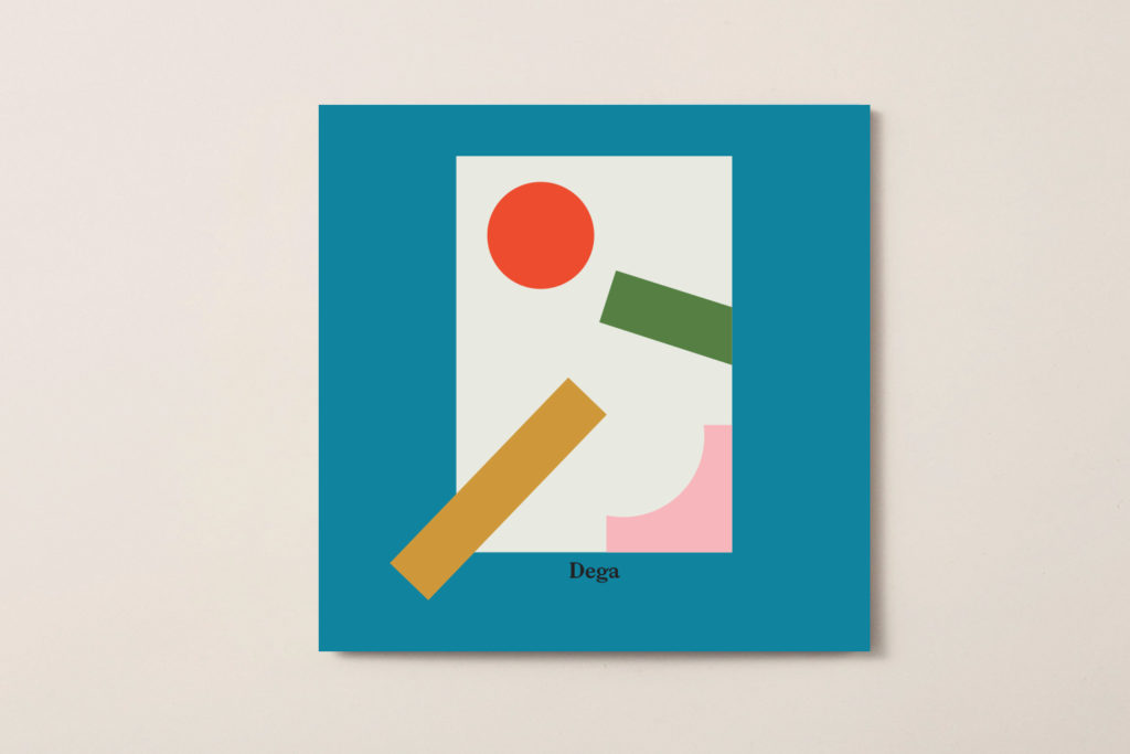
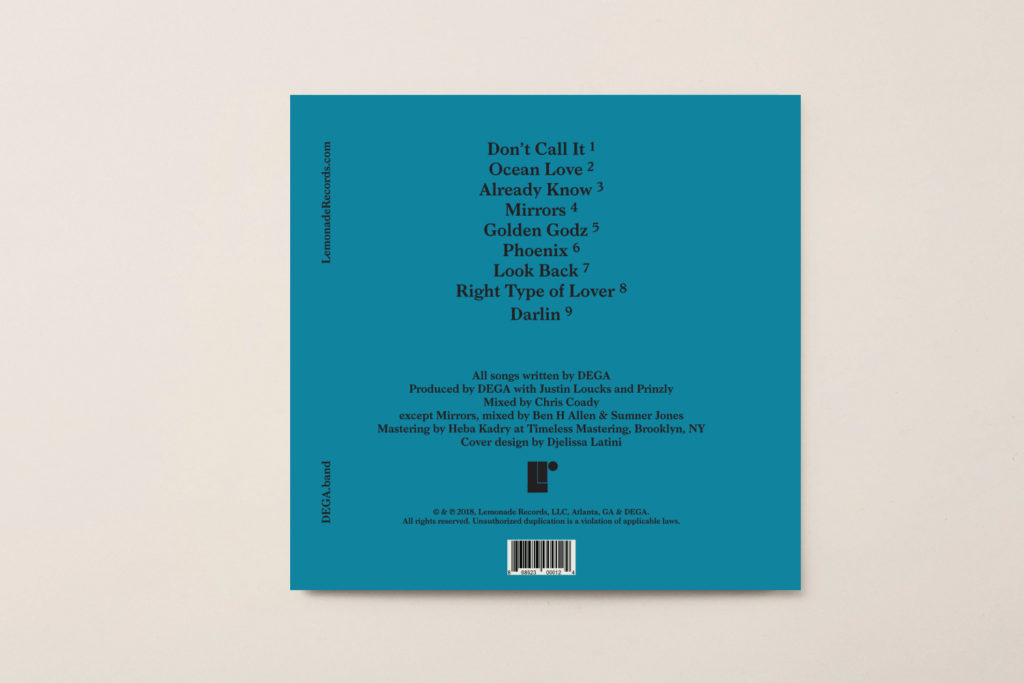
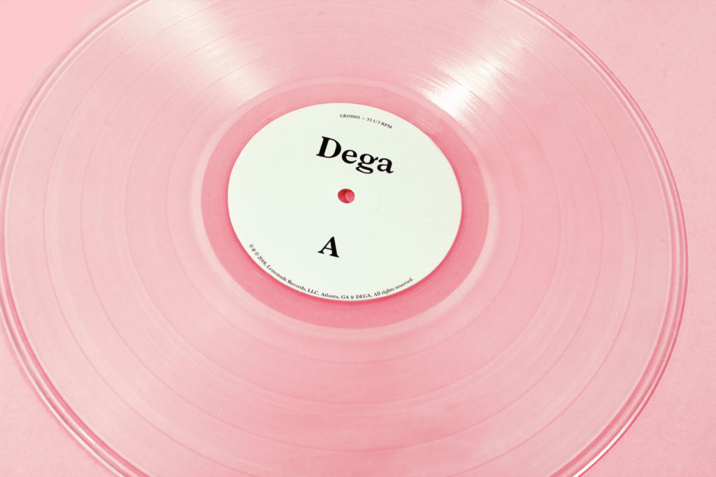
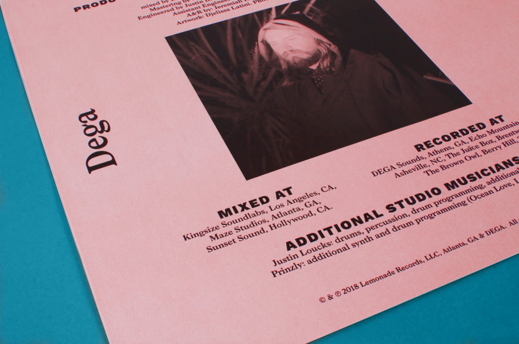
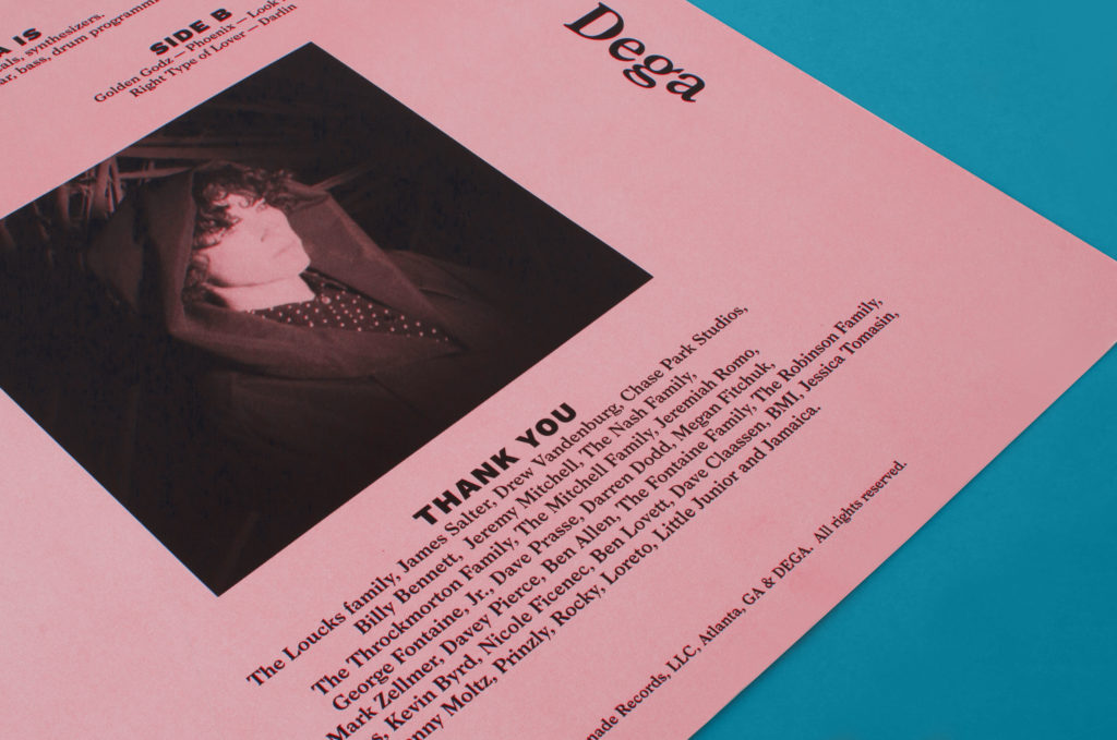
Dega
- art direction
I had the chance to work with the indie band Dega (Lemonade Records) for the launch of their first album’s record. Dega’s self-titled debut is comprised of nine ethereal, indie pop tracks that tell the story of the couple’s personal journey, along which they’ve encountered some spectacular highs and crushing lows. The main idea was to illustrate this concept of balance on the vinyle’s artwork with a dreamy and pop color palette that encapsulates the essence of their music.
I’ve also worked on social media content for their first U.S tour with Washed Out and merch design.
07 .
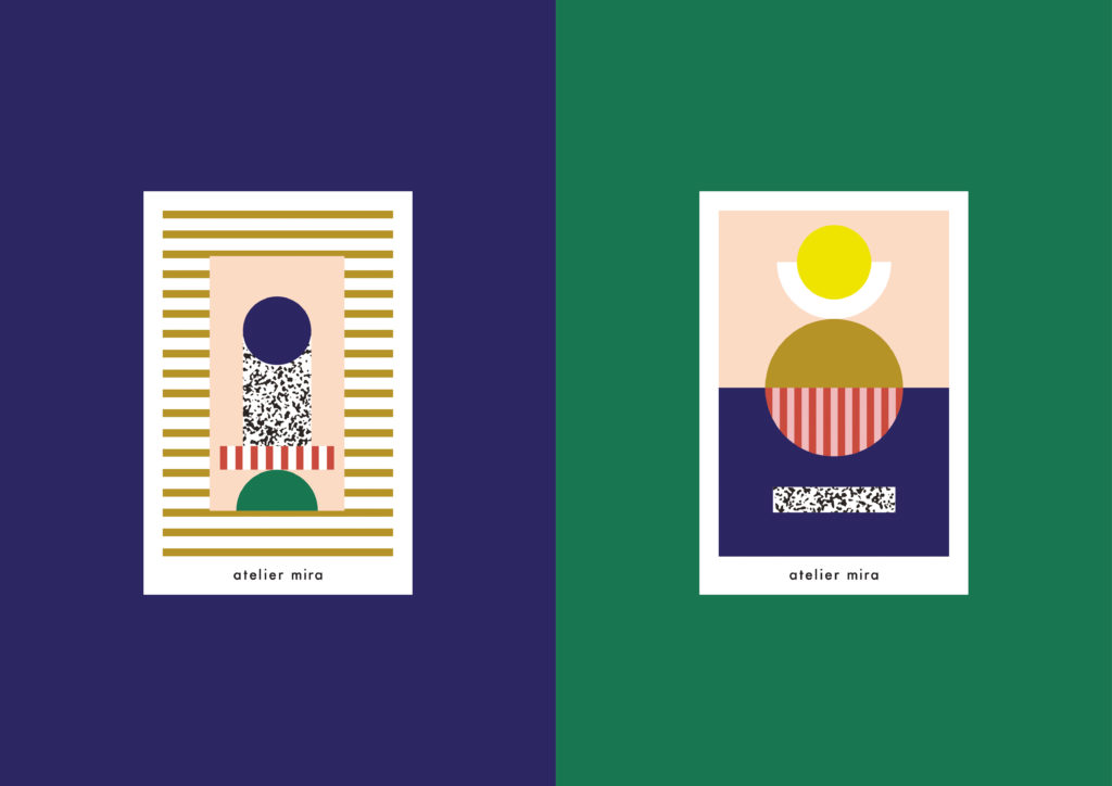
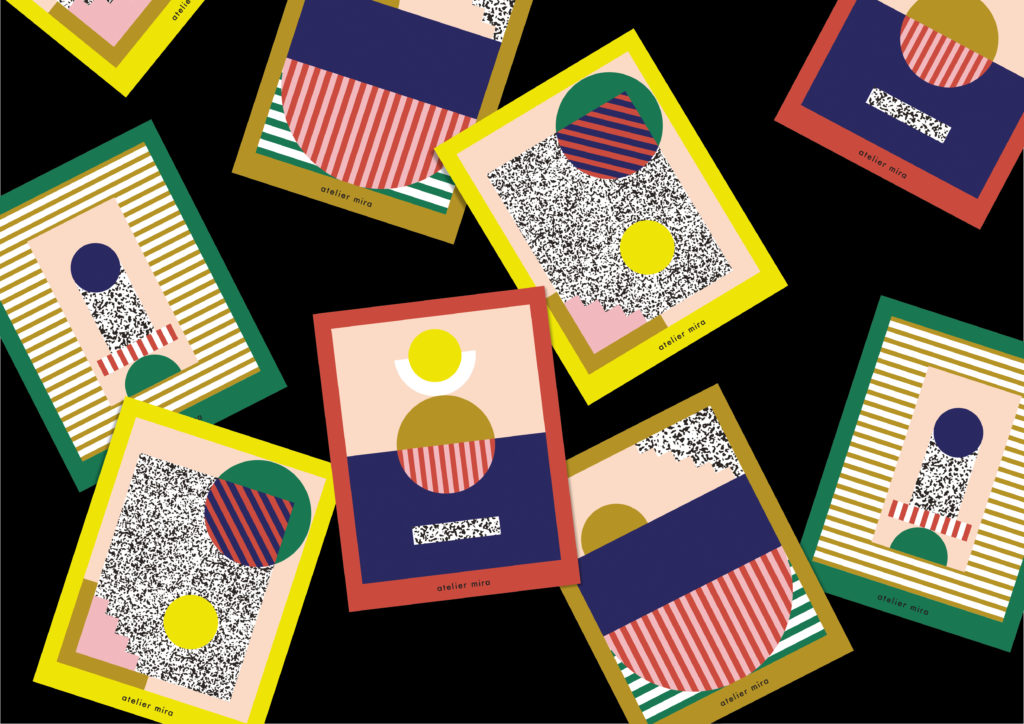
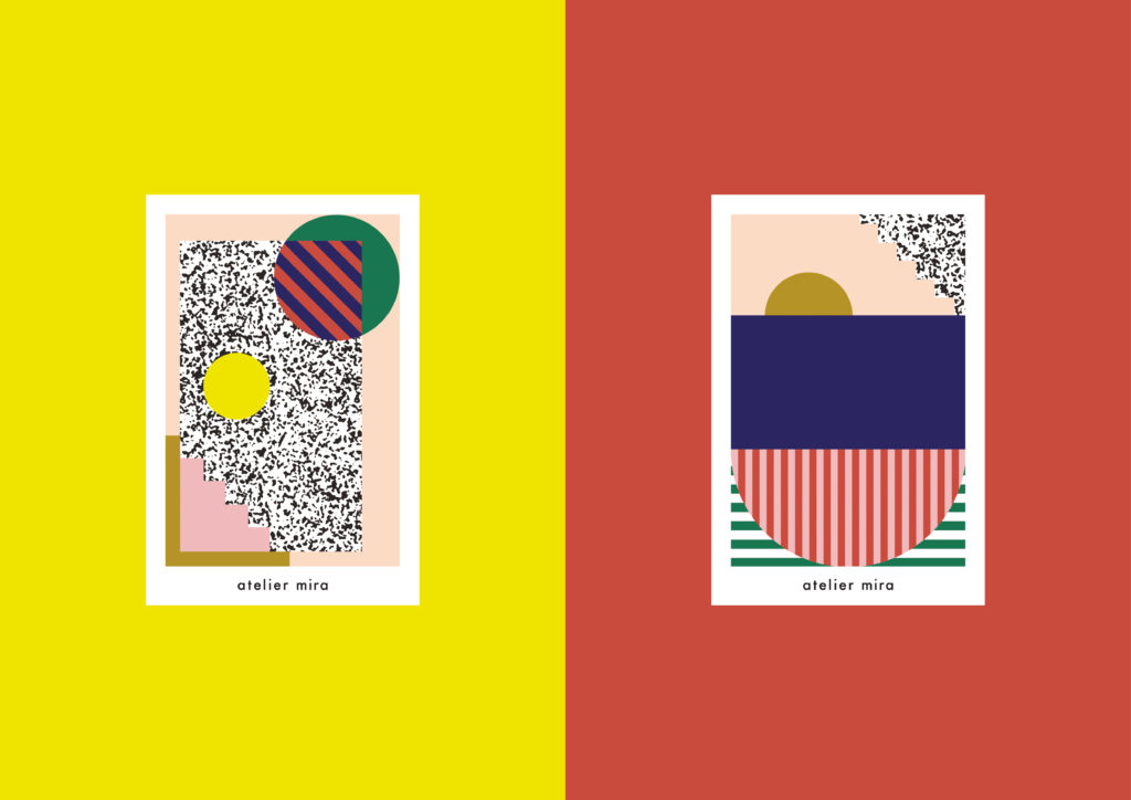
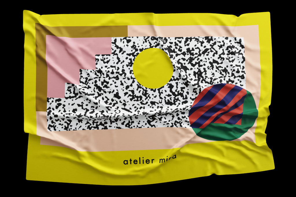
Atelier Mira
- illustration, stationery
Series of four illustrations to use on postcards and cleaning clothes for Atelier Mira, an optical boutique and lifestyle shop in Brooklyn, NY (US).
Commissioned for Fakepaper Studio (Paris).
08 .
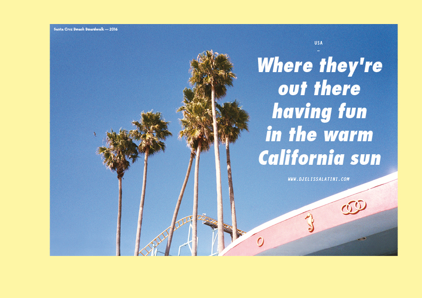
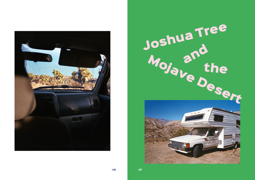
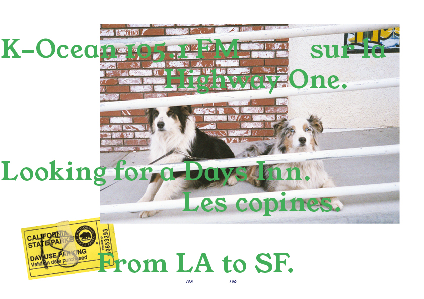
In the Warm California Sun
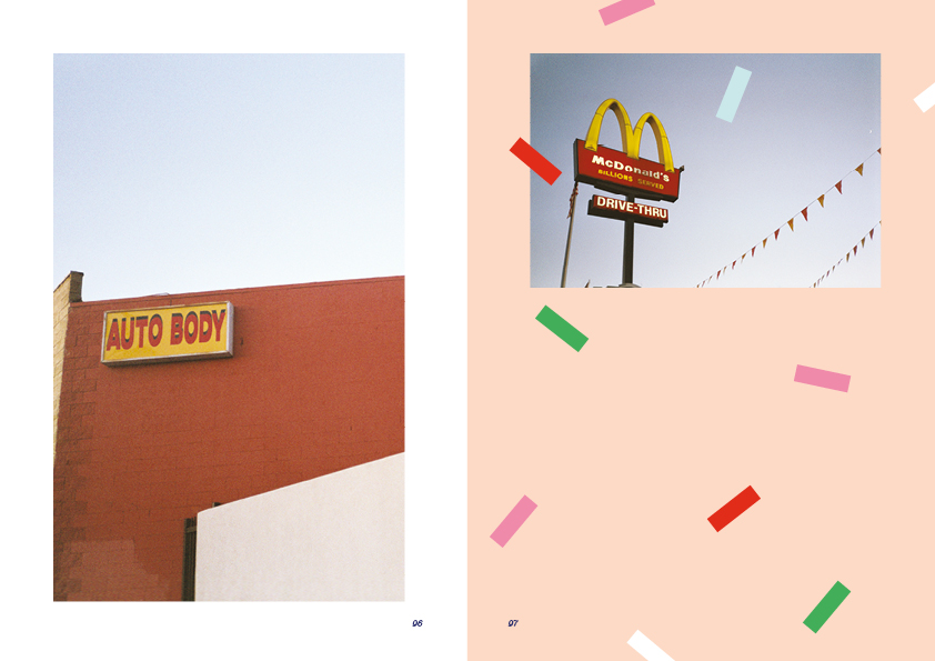
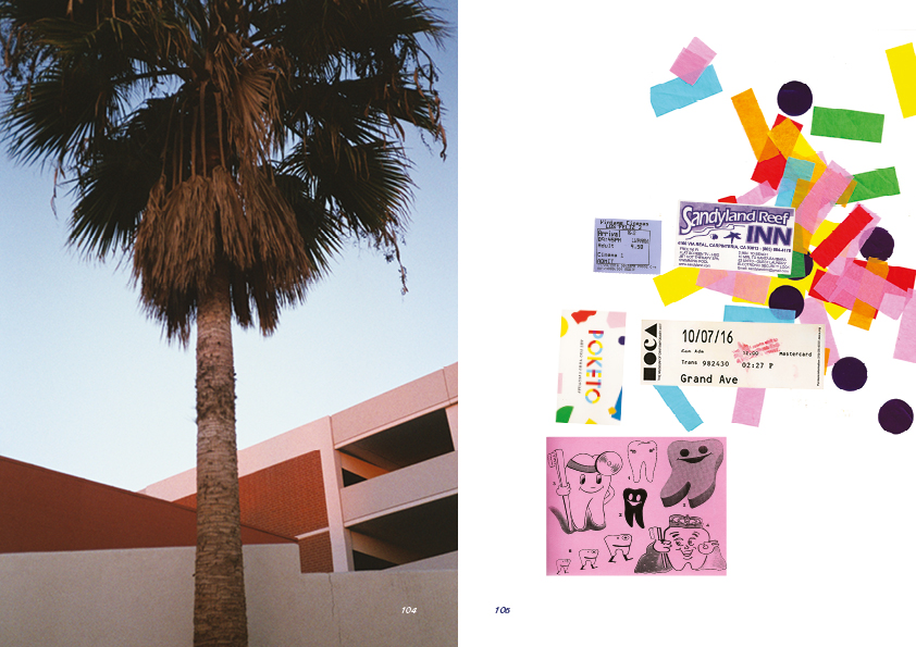
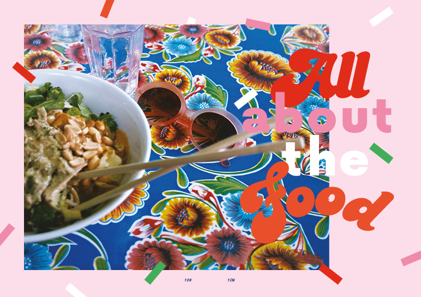
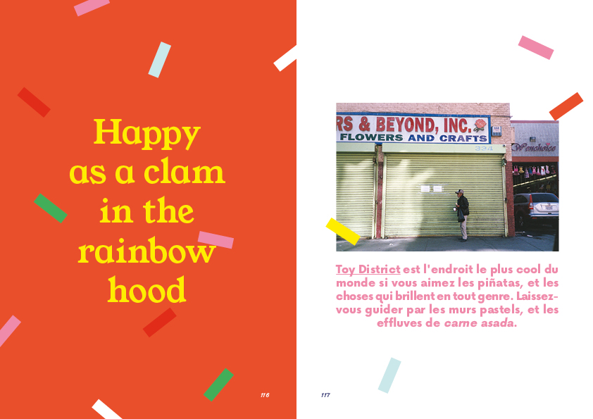
- photography, publishing
3petits points is a lifestyle magazine about fashion, culture and visual art based in Paris. As a contributor to issue 3, I had carte blanche under the theme travel. I created a colorful feature about my experience in California illustrated with analog photographs, and a cool city-guide.
09 .
Epicène
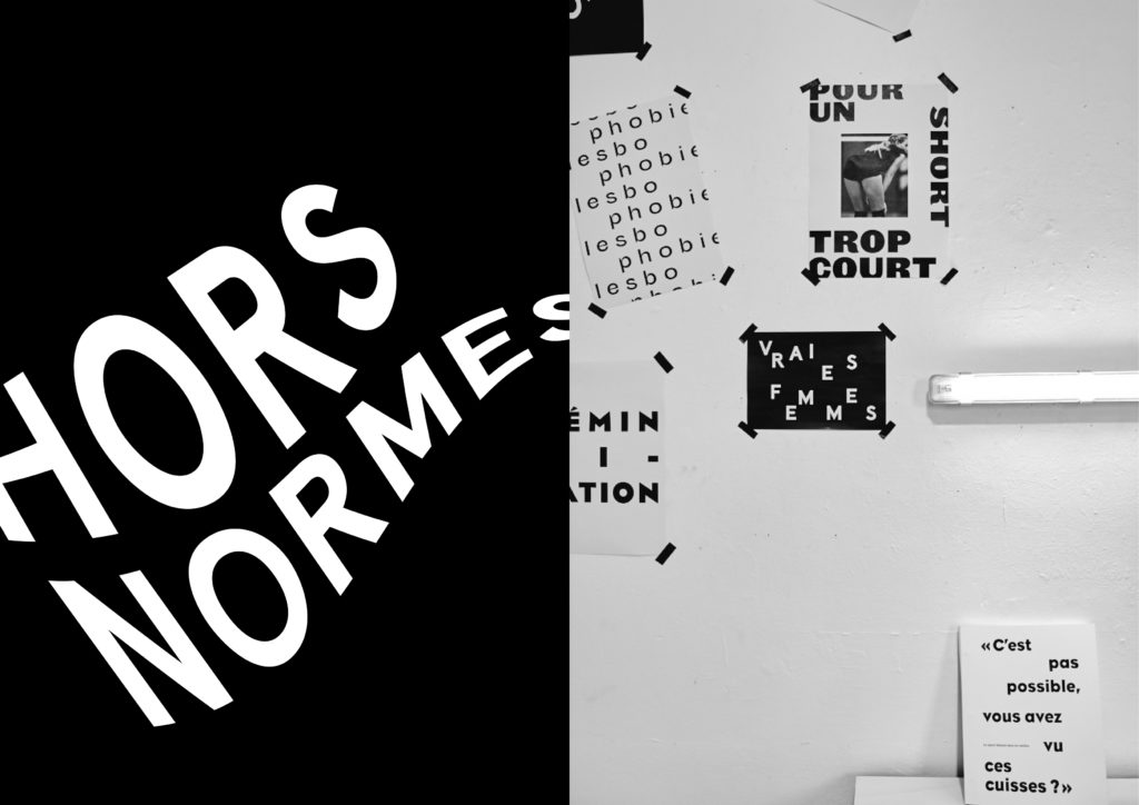
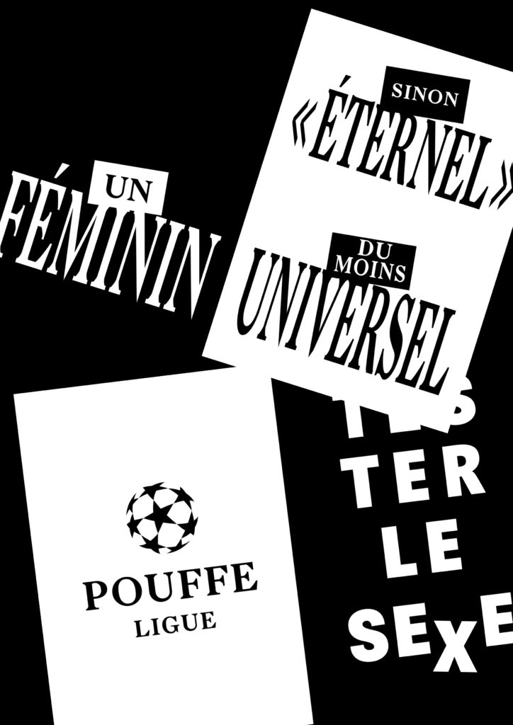
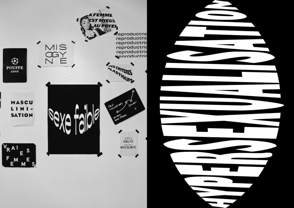
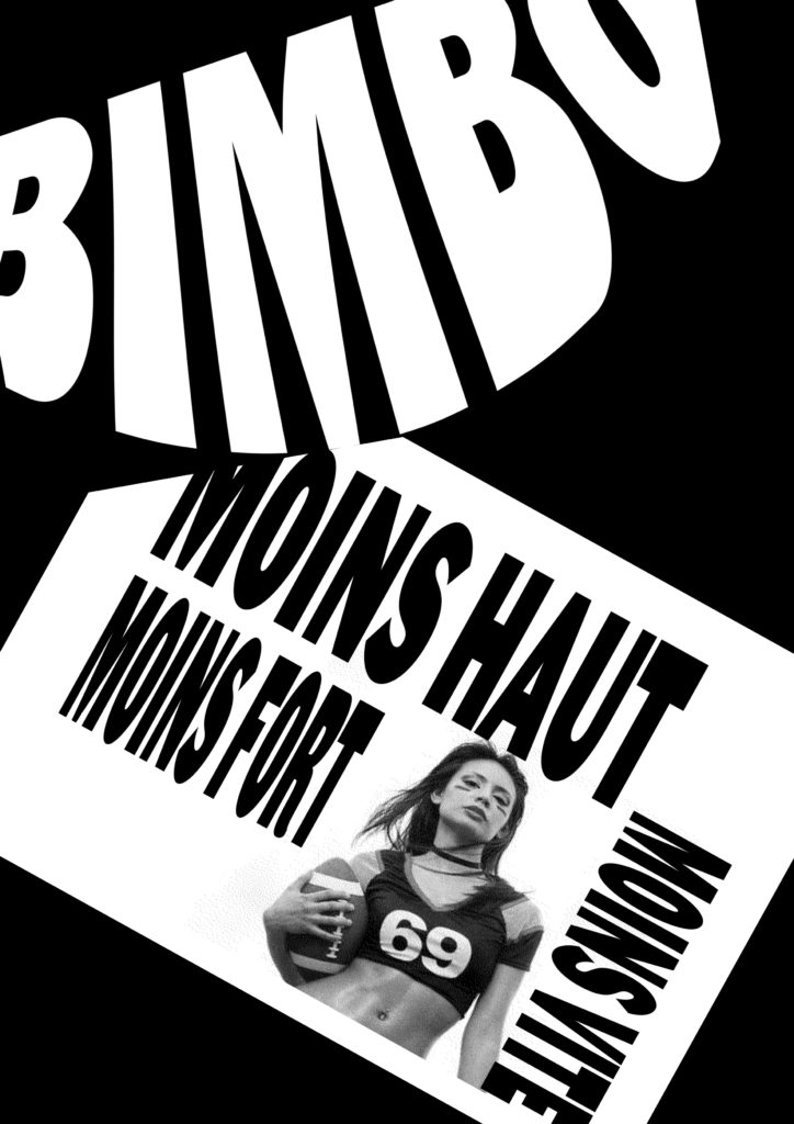
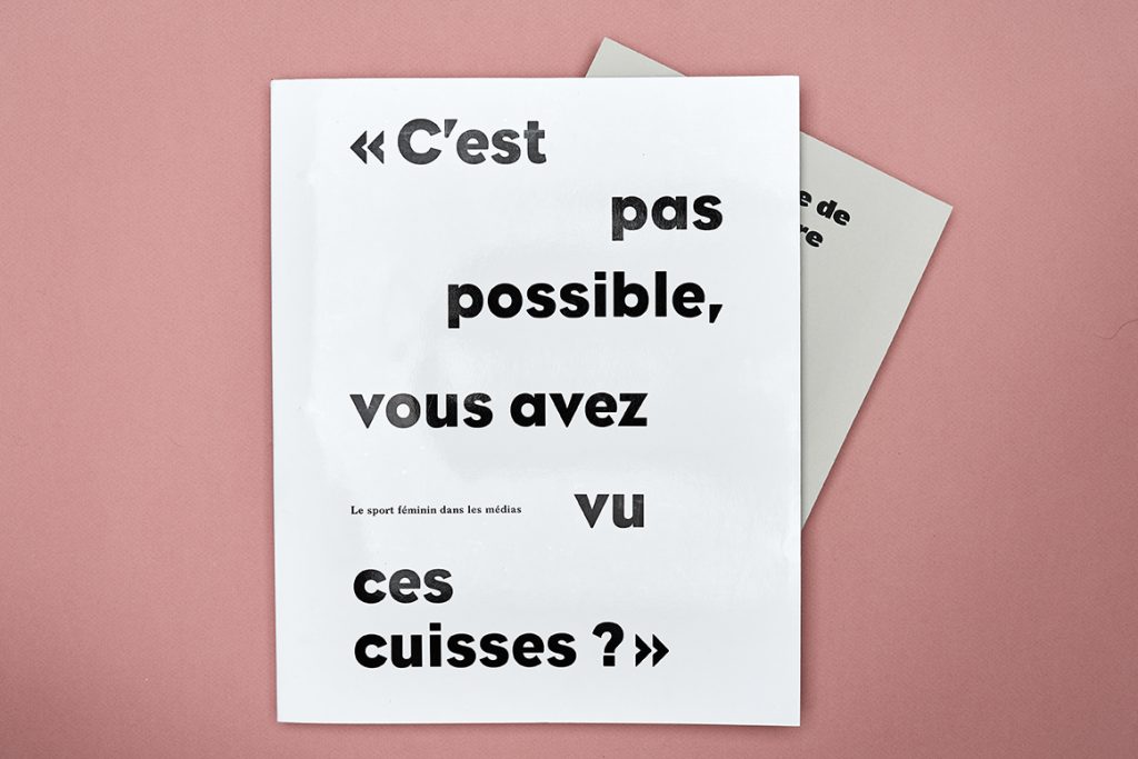
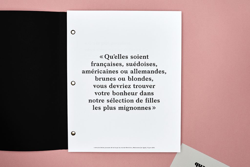
- book design, poster
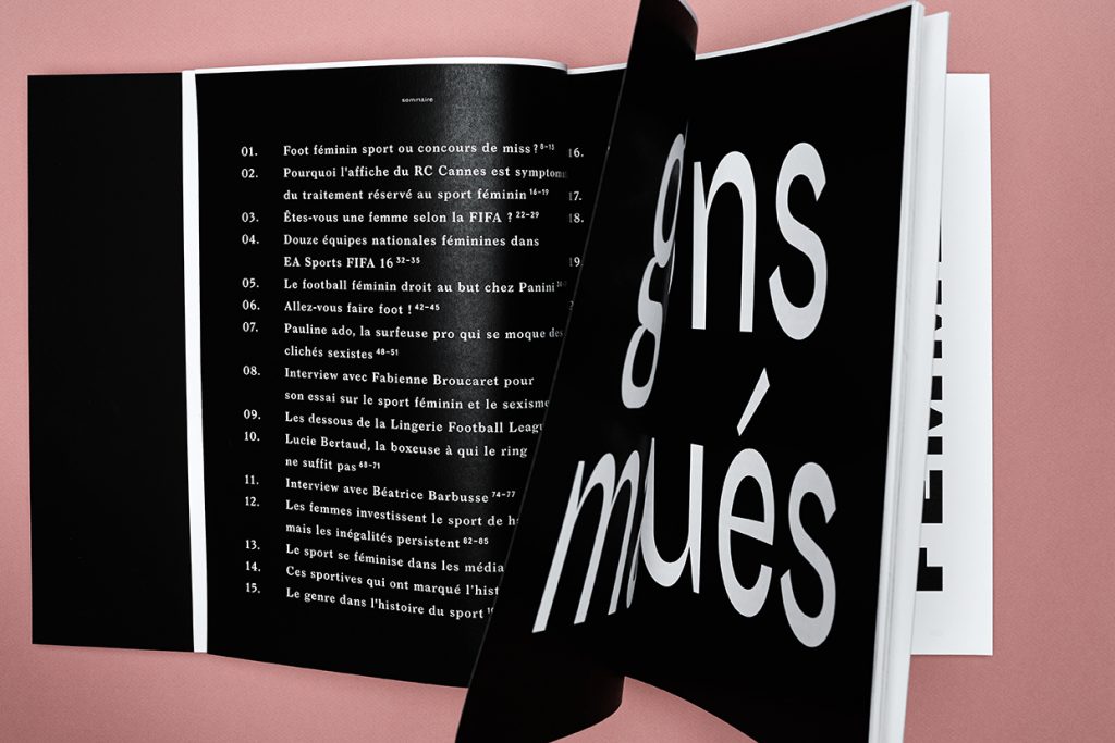
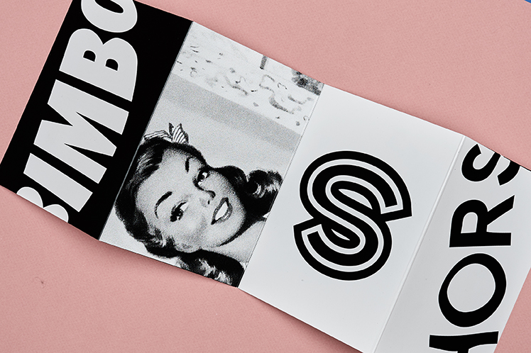
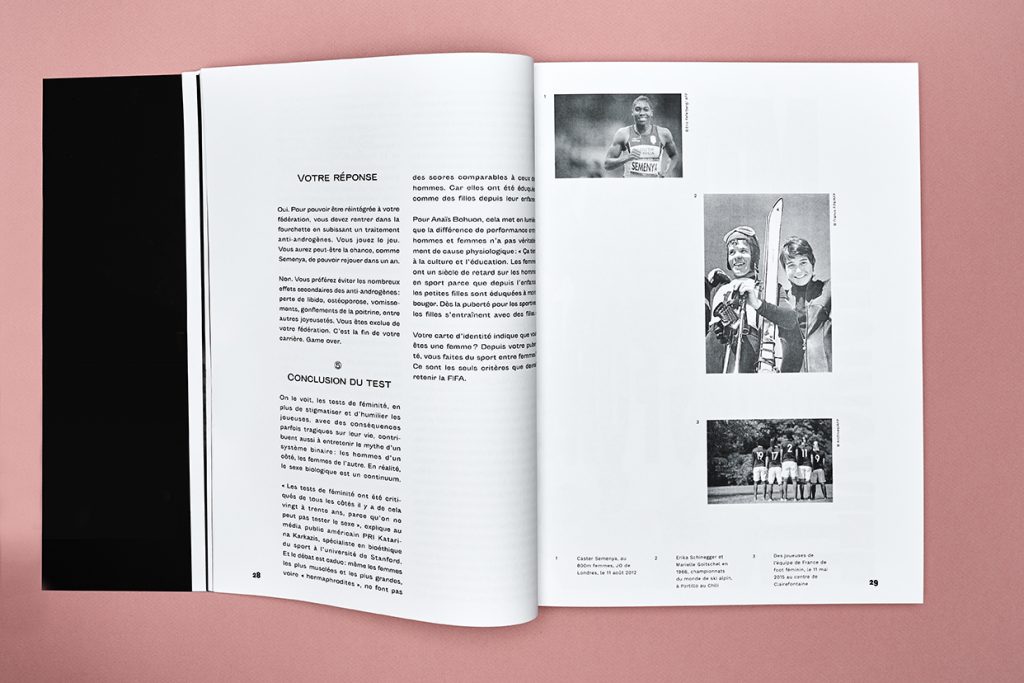
Epicène is an adjective that indicates lack of gender distinction, and thus represents something neutral. After having collected an endless list of mysoginist quotes extracted from different french media on the plight of female athletes in a male dominated world, I decided to create posters that put those words in a different context. Along this personal project, I’ve been documenting my exploration work in this limited book edition quoting articles and essays that depicts pure male gaze.
10 .
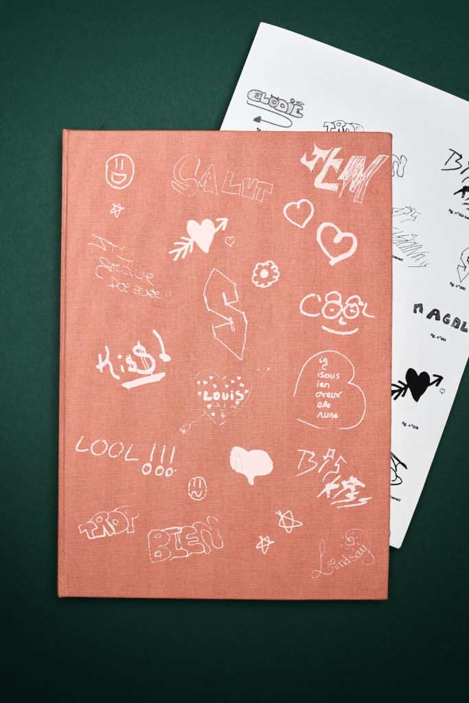
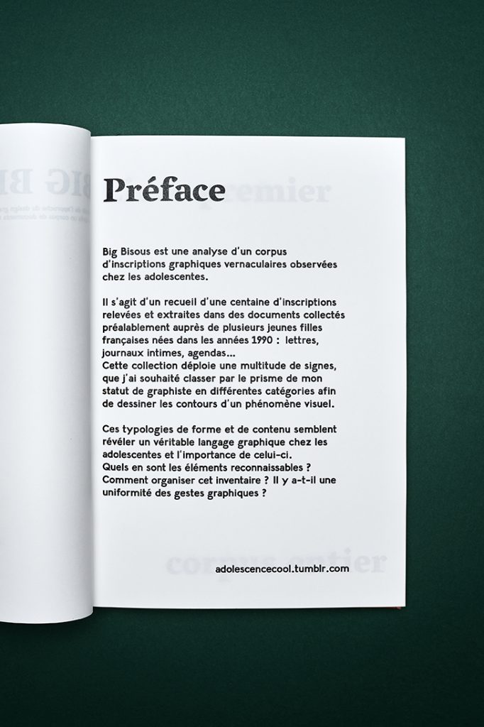
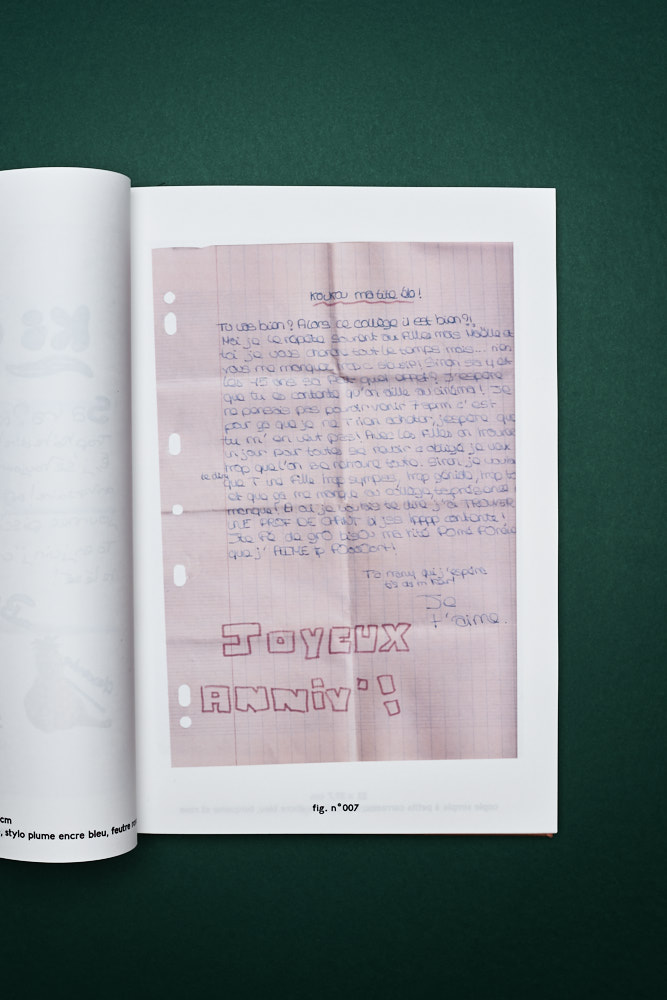
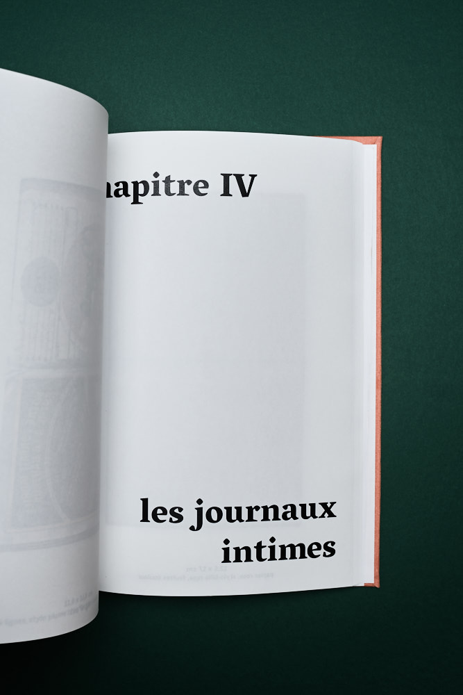
Big Bisous
- book design
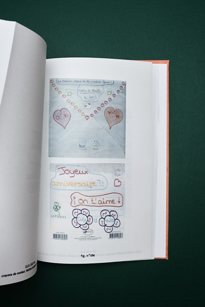
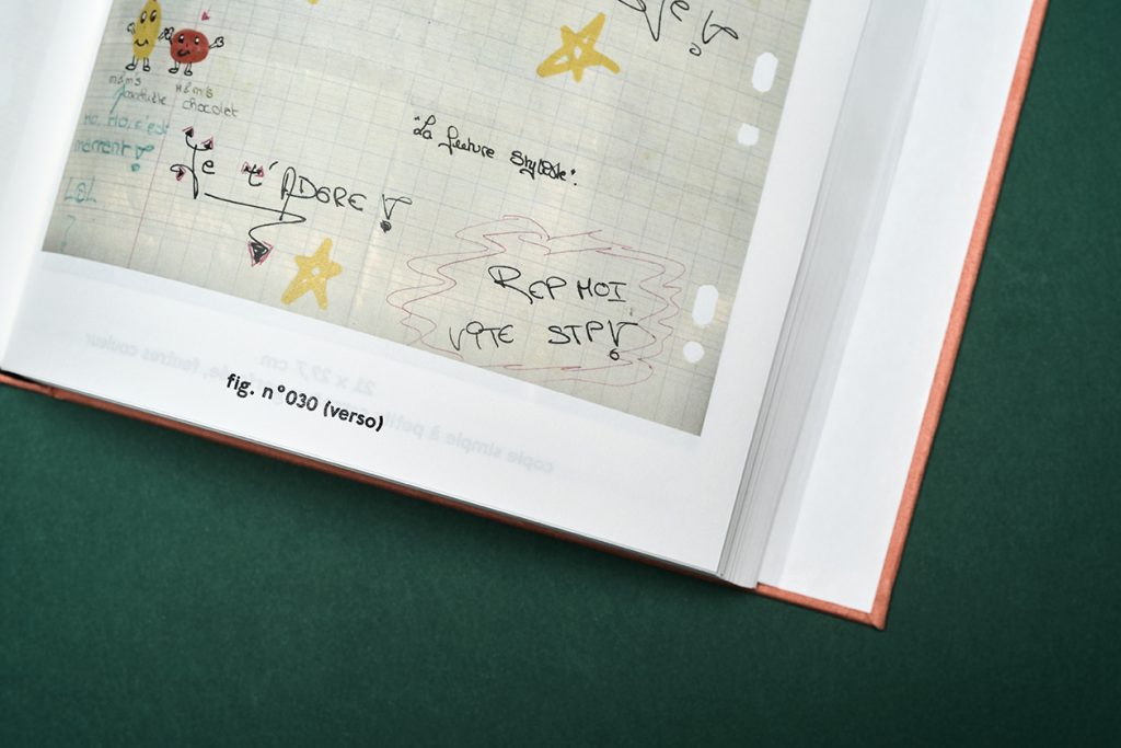
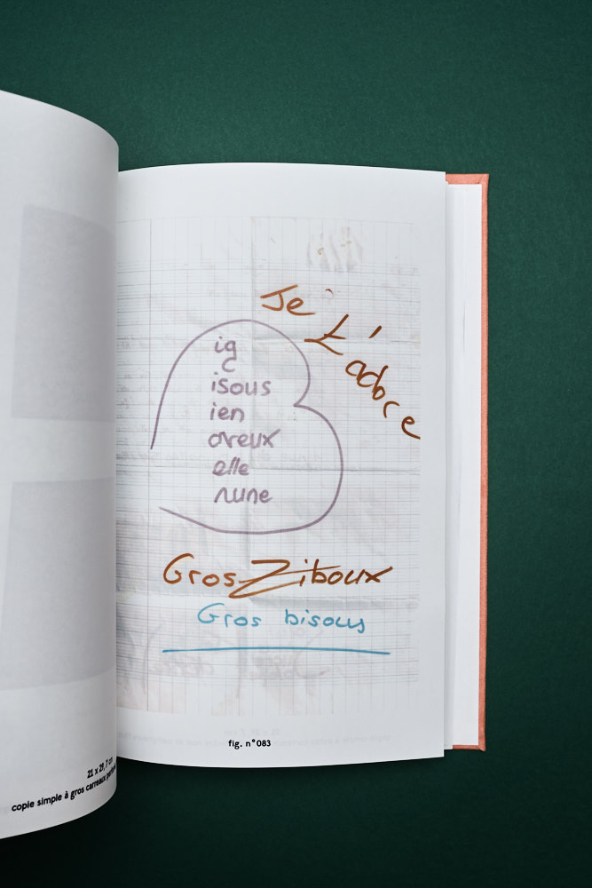
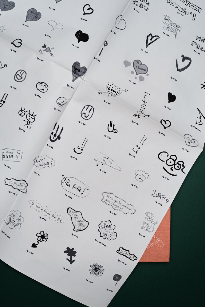
This personal project is an ode to teenage love letters and diaries. I collected a hundred of souvenirs that I classified according differents elements in order to reveal the repetition of strong graphic symbols.
Get in touch
Please email me
djelissa.latini@gmail.com
Call me maybe ?
+33 6 14 74 09 06
01
01 . Antidote Skateparks - branding
Founded by longtime skateboarders Pierre, Julien and Léo, Antidote Skateparks is a friend-run company that grew out of a simple desire to make the most fun, finely crafted skateparks possible. Craftsmanship and skate-ability remain at the heart of their business that builds concrete skateparks worldwide.
The main challenge was to build a cohesive and compelling branding to target their two different audiences. The identity merge the skate aesthetic and a minimalistic tone referencing to the engineering part of their job.
The logo is inspired by concrete skateparks elements, a solid box with curves that evoke a bowl. The color palette as well is based on textures reminiscent of skateparks with pops of bright colors.


02
02 . Olivia Latinovich - art direction, branding
Olivia Latinovich is a hat designer based in Los Angeles. Her new brand finds its narrative in the French Nouvelle Vague aesthetic, using feminine, vintage and bold fashion designs with pops of color. For the branding, we reinterpreted design elements from Biba’s and 1960’s Art Nouveau to create a contemporary logo, patterns and color palette.
Branding: logo & monogram creation, visual identity, packaging, social media guidelines
Project in collaboration with Leslie David Studio.
Photo: Brian McGuffog
03
03 . Not Pot - art direction, branding
Not Pot is a California based company specialized in vegan CBD gummies. Surfing on this new legal trend, these organic candies are made to help you relax without making you high. Branding in the CBD industry most of the time aren’t talking to women and millennials, they instead focus on recreative drugs aesthetic. Our challenge was to design a digital identity for a direct to consumer brand that came to life thanks to the creation of friendly stickers, a colorful palette, a vibrant typography, and a playful web design. We ended up creating fun and educative design content made to help consumers to understand CBD with a 70s twist.
Project in collaboration with Leslie David Studio.
04
04 . Maison Galant - visual identity
Visual identity of Maison Galant, a shop specialized in men’s grooming based in Strasbourg (FR).
Logotype, business cards, flyers, stationery.
Photo credit: Henri Vogt
05
05 . Ban.do - apparel, illustration
Ban.do is a lifestyle brand based in sunny Los Angeles that designs clothes, accessories, gifts, stationery, and more.
Since 2018, I’m part of their amazing team of artists among really talented women. I’ve been commissioned to create surface design for their SS 2020 clothing collection – this is inspired by tees and ephemera you could find at flea markets, thrift stores or gas stations! It was very fun to work on the concept, copy and design and challenge myself to do more illustration.
06
06 . Dega - art direction
I had the chance to work with the indie band Dega (Lemonade Records) for the launch of their first album’s record. Dega’s self-titled debut is comprised of nine ethereal, indie pop tracks that tell the story of the couple’s personal journey, along which they’ve encountered some spectacular highs and crushing lows. The main idea was to illustrate this concept of balance on the vinyle’s artwork with a dreamy and pop color palette that encapsulates the essence of their music.
I’ve also worked on social media content for their first U.S tour with Washed Out and merch design.
07
07 . Atelier Mira - illustration, stationery
Series of four illustrations to use on postcards and cleaning clothes for Atelier Mira, an optical boutique and lifestyle shop in Brooklyn, NY (US).
Commissioned for Fakepaper Studio (Paris).
08
08 . In the Warm California Sun - photography, publishing
3petits points is a lifestyle magazine about fashion, culture and visual art based in Paris. As a contributor to issue 3, I had carte blanche under the theme travel. I created a colorful feature about my experience in California illustrated with analog photographs, and a cool city-guide.
09
09 . Epicène - book design, poster
Epicène is an adjective that indicates lack of gender distinction, and thus represents something neutral. After having collected an endless list of mysoginist quotes extracted from different french media on the plight of female athletes in a male dominated world, I decided to create posters that put those words in a different context. Along this personal project, I’ve been documenting my exploration work in this limited book edition quoting articles and essays that depicts pure male gaze.

10
10 . Big Bisous - book design
This personal project is an ode to teenage love letters and diaries. I collected a hundred of souvenirs that I classified according differents elements in order to reveal the repetition of strong graphic symbols.